Sign up for The Media Today, CJR’s daily newsletter.
If the best journalistic design reflects its subject, then newspaper and magazine designers in the Trump era are appropriately thinking in bold strokes, multi-column headlines, and tons of yellow and orange hues. But one of their biggest challenges is telegraphing which story takes priority, since all of them do.
Everything is must-see and must-know: The Trump presidency—with its unorthodox approach to how “official” news is presented (often on Twitter), the speed with which events develop, and the chaos surrounding the whole circus—puts us in an unprecedented time in history.
For designers, it’s an opportunity to showcase our craft’s role in signaling the significance of news, presenting it in an easy-to-find and easy-to-understand manner, and yet allowing for readers to feel the impact of each new development. A CJR review of newspapers, magazines, and websites around the world suggests news designers are embracing the challenge. Here are a few highlights of our global tour:
Big, bigger, biggest headlines
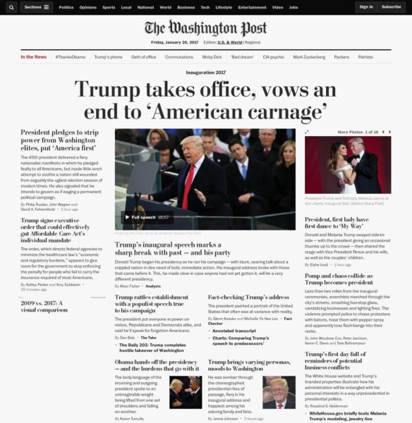
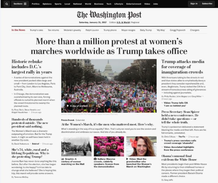
Even traditional publications such as The New York Times and The Washington Post, which tend to save multi-column headlines for stories of major significance, have displayed larger headlines more often—in print and online—since the inauguration of President Trump. It’s tough to see the one-column headlines when the news agenda is packed with stories that compete for top billing. Take a look at these multi-column headlines from WashingtonPost.com.
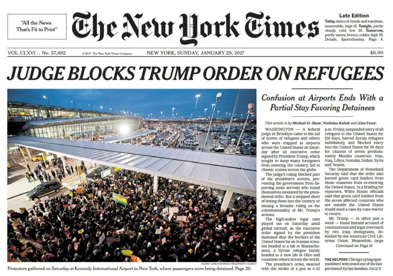
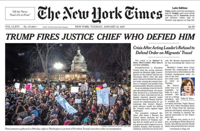
Meantime, The New York Times carried a six-column headline in all caps—“Judge Blocks Trump Order on Refugees”—on the cover of its late print edition on January 29, a treatment we don’t see too often and which alerts us to a story of major significance. The Times used the same template two days later for a headline about Trump firing the acting attorney general.
RELATED: Donald and Melania Trump’s relationship through a lens
Is it possible that newspaper editors and designers are too fast out of the gate with their boldest, biggest, and widest treatments for stories? What will happen as more major developments continue to fill the news agenda? One wonders how often this strategy can be utilized before it loses its impact—another major challenge on the mind of news designers.
Design in the era of Trump
What is the visual storyteller to do? How does one apply the essential rules of design: Make it easy to read, make it easy to find, and make it easy on the eyes? Since the same stories are going to appear in a variety of outlets, the designer has the ultimate challenge: to seduce visually with a story that may already be known. Good designers answer the call.
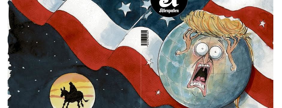
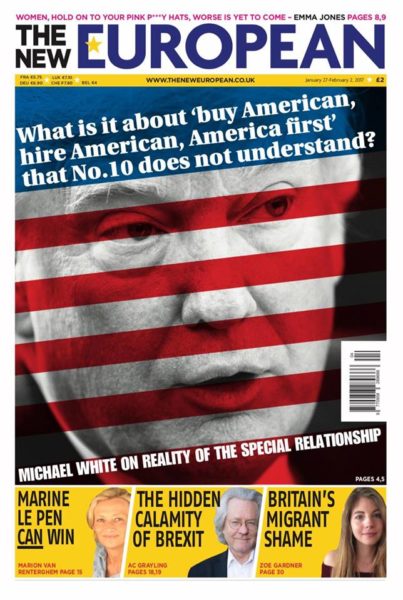
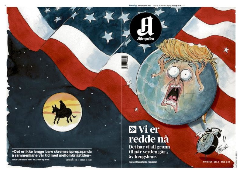
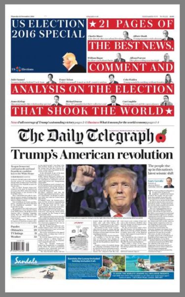
For news designers, the color palette is the easy part. Everything about Trump relies on two powerful hues—orange and yellow. Caricatures have never been more popular. “I think newspapers have seen caricature as an obvious response to Trump because he is such a caricature of a man,” says Matt Kelly, editor of the UK’s The New European, in an email. We also see a lot red, white, and blue, and American flags, as in these pages from The New European, Aftenposten (Norway) and The Telegraph (UK).
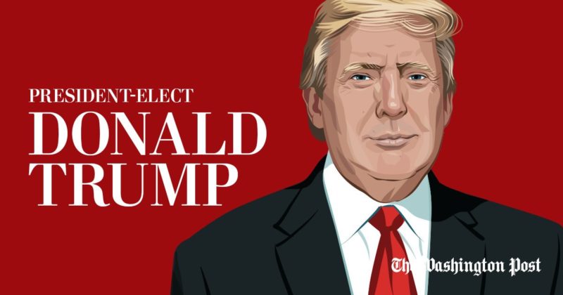
The Washington Post commissioned Ben Kirchner to draw a full-body Donald Trump, with a cropped version serving as a social media card for Election Night. The image depicts a pleasant, if not flattering, image of President Trump, including a half smile. The Post’s illustrations of the candidates gave it a distinctive look that attracted attention and created familiarity for the audience.
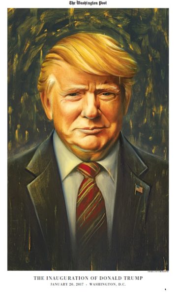
Separately, the Post commissioned Chris Buzelli to do a illustration poster for its inauguration section.
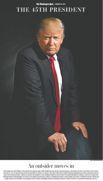
The same section featured on its cover a portrait of Trump by Post photographer Matt McClain that emphasized President Trump’s eyes and his much-discussed hands. I wonder whether the president would consider that portrait as an official one to hang in the White House?
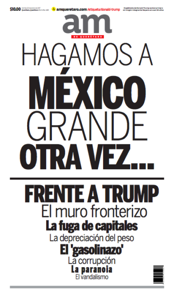
‘The Wall’ inspires designers in Mexico
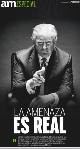
President Trump’s promised “Wall” along the Mexican border has in particular inspired news designers and journalists south of the US border. This front page from Mexico’s am carries only type on the cover for a headline that reads: “Let’s Make Mexico Great Again.” Another section uses the headline: “The Threat is Real.”
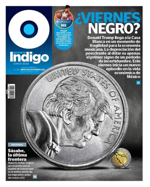
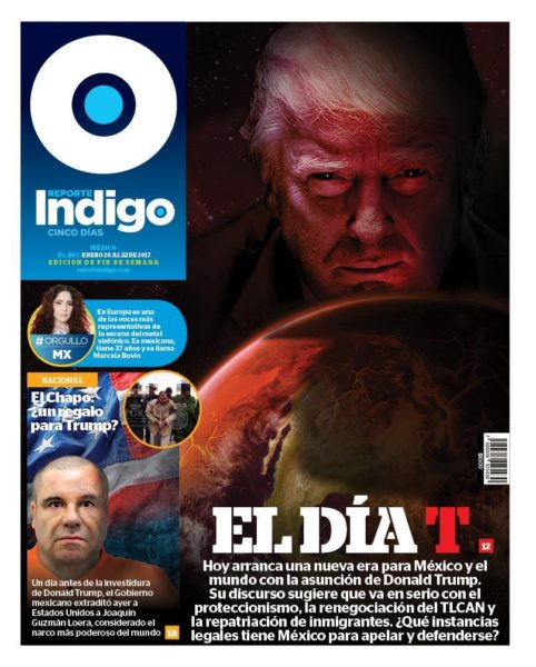
The Mexico City daily Indigo deals with Trump and the economy in this powerful front page comparing US currency to the Mexican peso.
On Inauguration Day, Indigo carried a somber image of Trump with the headline that translates to “D Day.”
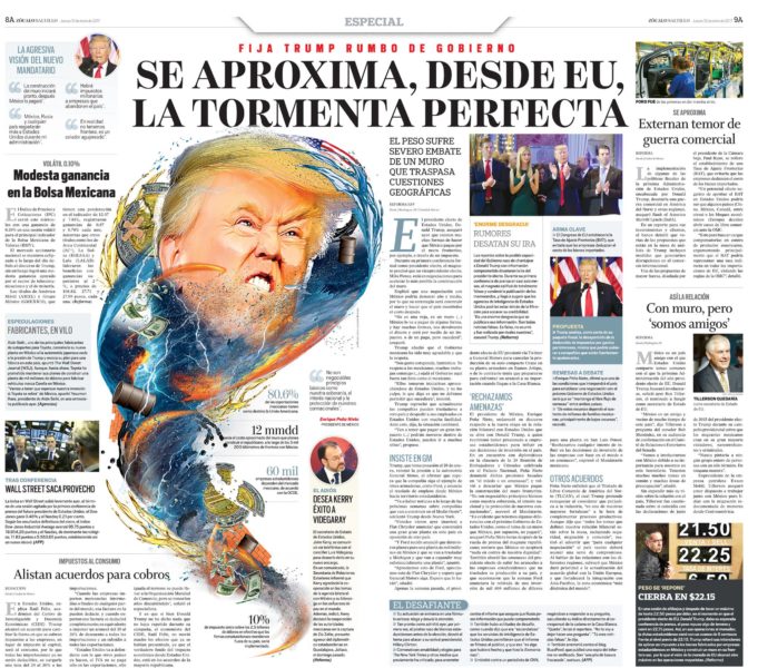
And a double page spread from El Zocalo (Saltillo) carries a headline that reads (translated): “Getting near, from the US, the perfect storm.”
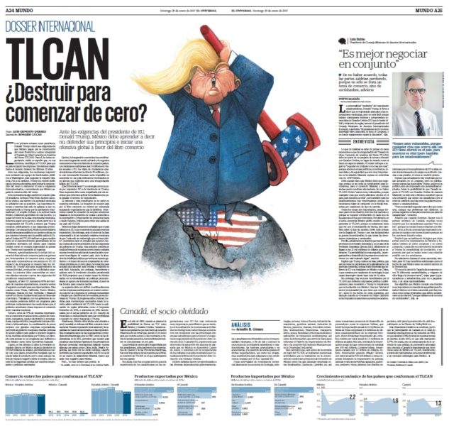
For Mexicans, the construction of a wall is not the only concern under a Trump White House. The trade agreement NAFTA, another piece of the Trump agenda that would greatly affect the Mexican economy, inspired this spread in the daily El Universal.
The cartoons
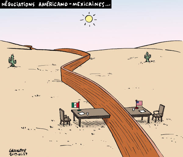
Cartoonists, too, are bringing sharp commentary and fun visuals to the pages of newspapers and magazines. Here we see two from Canada. One from Le Devoir (Montreal), about the negotiations between Americans and Mexicans over the proposed wall, and the other one from La Presse (also Montreal) making a reference to Trump’s first press conference with journalists.
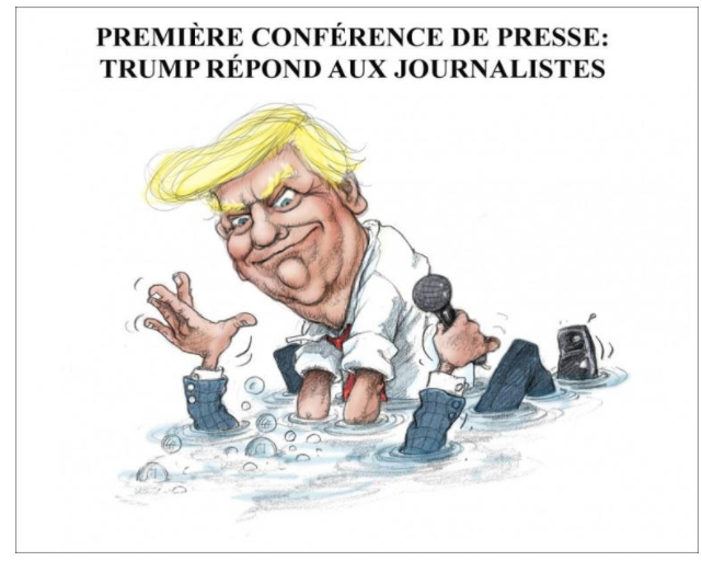
Infographics and Trump
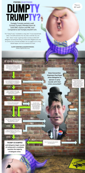
Infographics artists have also kept busy with the numbers that are such an important part of the story. Here is a fun, but informative, pre-election treatment with a graphic and page designed by Jeff Goertzen, art director of The Orange County Register.
I spoke with him about his inspiration: “The Dumpty Trumpty page took a satirical look at the process that would have to unfold for the RNC to effectively dump Trump. The building of a ‘wall’ and the words ‘Dump Trump’ suddenly gave me the idea to illustrate Donald Trump as Humpty Dumpty and use it in this context to explain the complicated process of what it would take for the RNC to Dump Trump,” he says. “I received a few phone calls from angry readers for this one for publishing it in our news section with such political overtones.”
Related: 12 images that capture the new reality show at Trump Tower
On the covers
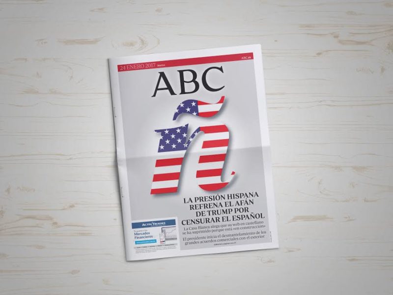
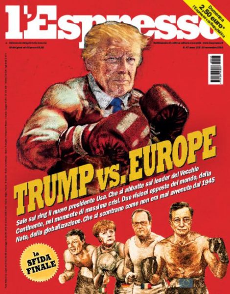
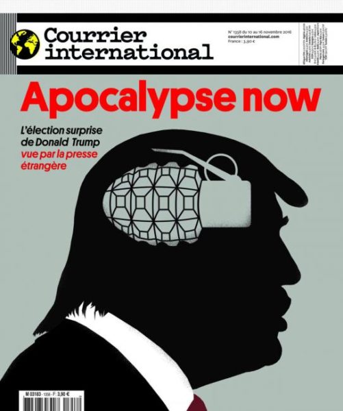
Behold the magazine cover. Editors and designers have long recognized that nothing makes for a better cover image than a person. When that person is Donald J. Trump, it usually is more than just his photograph, as seen in these examples from Letras Libres (Mexico and Spain), Ad Busters, and Der Spiegel (Germany). Meantime, The Village Voice zeroes in on Trump’s signature.
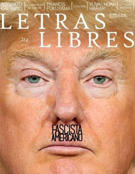
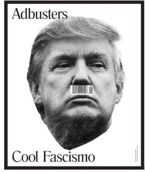
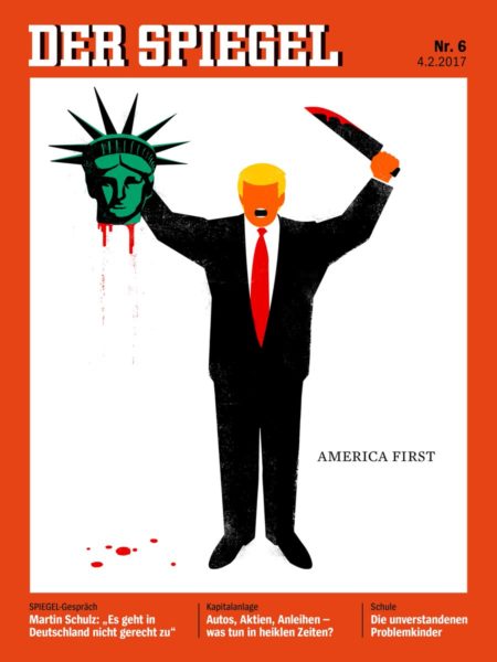
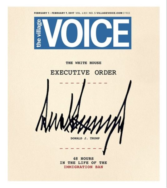
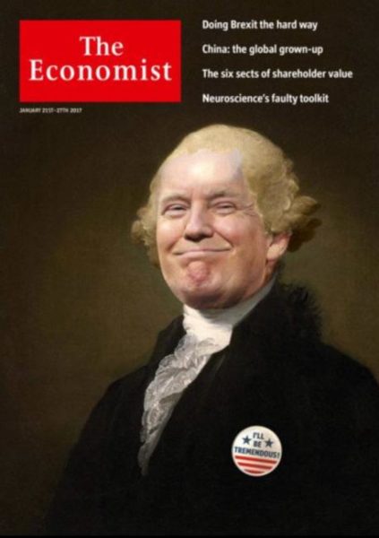
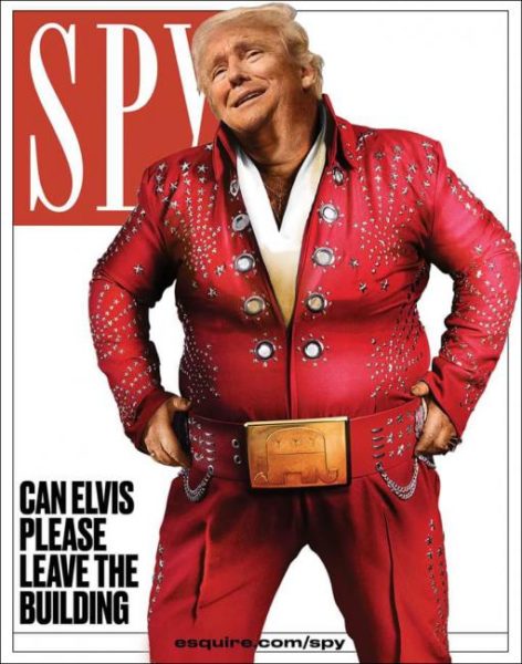
The Saturday Night Live writers aren’t the only ones having a bit of fun with President Trump and his team. The following covers show how some art directors, too, have decided to explore humor and satire in print.

The type attacks
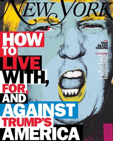
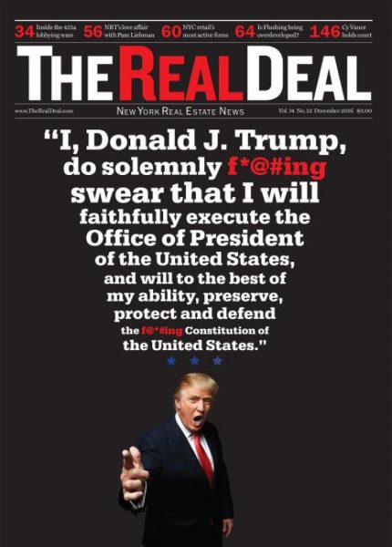
Sometimes magazine cover artists go for what I call a “type attack,” as we see in these examples from New York and The Real Deal.
A face made for photo editing
Using dramatic photo crops of President Trump’s head is how some art directors solve the issue of showing more than just the familiar face that appears in so many publications at the same time. Here we see such treatments in Brazil’s Veja, The Stranger (US), Le Nouvel Observateur (France), and the San Antonio Express-News.
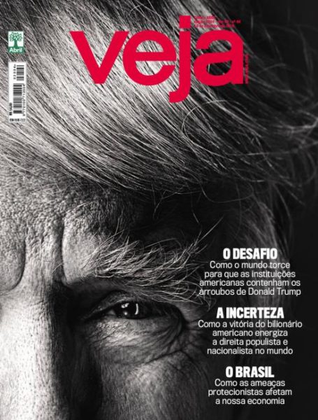
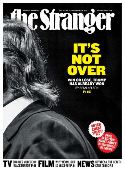
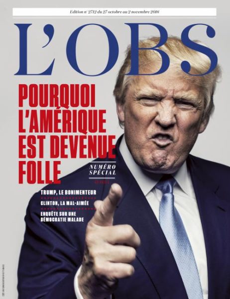
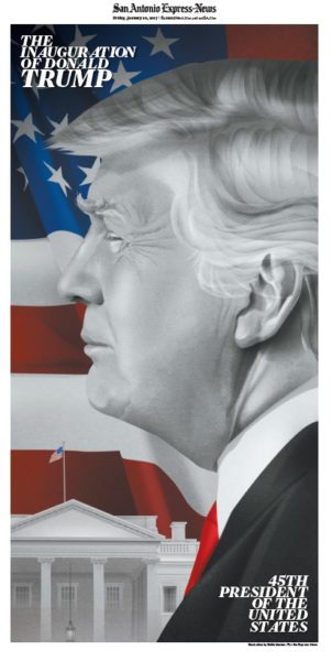
Today’s visual storytelling is key to how getting us into stories. We live in the midst of the journalism of interruption, and the role of design has never been more essential. It is satisfying to see, in all these examples, that there is a great connection between editorial and design thinking. The fusion of writing/editing/design, which I refer to as WED, has never been more important.
It does not hurt to have a story that gets more intriguing by the day.
Correction: An earlier version of this story misidentified a Washington Post photo.
Has America ever needed a media defender more than now? Help us by joining CJR today.

