Sign up for The Media Today, CJR’s daily newsletter.
If you were breathing and near a computer or TV earlier this month, you couldn’t escape the story about a passenger violently dragged from an overbooked United Airlines plane. Rather than focusing on the salacious video or the minutiae of airline contracts of carriage, let’s look at a great second-day story: what the PR nightmare meant for United’s business.
Without reading ahead, guess which of these three headlines performed best:
Fortune: Here’s How Much United Airlines Stock Dropped After Passenger-Removal Controversy
Gizmodo: United Loses $800 Million in Value After Passenger Dragged Off Plane
MarketWatch: United’s Stock Is Falling 3% and Wiping $675 Million Off the Airline’s Market Cap
The second headline blew the competition away. But the “why” behind its success is far more important than looking at metrics alone; the numbers aren’t always replicable, but the underlying logic is.
No matter how great your content is, if you don’t package it properly, few will read or share it. Writing a great headline and choosing a dynamic main image for every article matters more now than ever —on a crowded Facebook feed that’s already tuning out link posts for video, you’re playing a zero-sum game for your audience’s attention. That headline and image are frequently all anybody’s going to look at.
TRENDING: 11 images that show how the Trump administration is failing at photography
Writing bulletproof headlines and selecting dynamic images isn’t rocket science. It’s more like lawn-dart science. Like any other task, the more you do it, the better you get at it. But even seasoned writers and editors screw this stuff up all the time to the detriment of all that hard work. Ask yourself what’s in it for the reader. Consider important points of reference and relative values to the average person. You have to dig into the ideas that drive why people care, and why they’re inclined to share. It might take a few minutes, but when someone’s spent hours, days, or weeks writing a great story, you owe it to everyone—the writer and the audience—to ensure you’ve packaged an article as best you can.
Every advantage we can wring from our sales pitch to readers matters. Let’s focus on how to improve your presentation without doing anything untoward.
Don’t write garbage stories
The alchemy behind shareable stories starts by not producing garbage. If you slap a great headline and image on a worthless article, you’ll piss off your audience. Remember Upworthy circa 2013? Well, rather than making you guess what happens next, it’s this: People close out your site, get turned off by your brand, and Facebook crushes your unsustainable model. It was a fun ride, though.
Of course, there will always be games. The new one is fake news, but “bat boy” has been living in a cave since the early 1990s. Getting salacious and farcical corrodes your brand equity. Don’t do that. And while fake news showed that brands don’t matter the same way they used to, you still need to offer the audience a reason to listen to you. That starts with knowing what your audience wants and delivering it without being slimy.
Now, let’s get to a concrete example of how a well-packaged story beats all others, even when dozens of copycat stories use the same material cloth.
Give your audience what it wants
For starters, you need to know your audience and what it likes. For most publishers, that involves analytics and KPI study—but as this 2016 Reuters Institute study explains, hearing that engaged time on an article is five seconds and knowing what you can do about that are not one in the same.
MarketWatch had an excellent, but simple angle in monitoring United’s stock the day after the Internet outrage. In fact, the company’s stock dipped by as much as 4.5 percent on Tuesday, April 11. MarketWatch’s article was published and promoted right around the stock’s nadir.
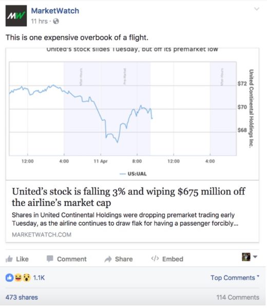
It’s a good story, without doubt. Fortune did just about the same story, which was promoted slightly later.
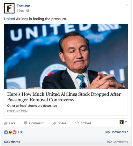
Fortune’s article performed slightly better, with 1,800 interactions, compared to MarketWatch’s 1,100. The photo on Fortune’s version is a lot more appealing—even if you don’t know Oscar Munoz is the airline’s CEO. He’s got a face, and you can tell he’s not a happy man. Another drawback of the MarketWatch packaging is the graph makes it look like the stock is rebounding—not all doom and gloom.
Then comes Gizmodo’s version of the same story—the clear winner.

Gizmodo wrote what’s effectively the same story, but with a superior headline that led to 25,000 shares and 89,000 interactions.
To be clear, both MarketWatch and Fortune are terrific, business-oriented publications; Gizmodo is decidedly not a business publication. But these sites overlap here, and their Facebook page likes are at least in the same ballpark.
Let’s dig into the why Gizmodo’s story blew up.
Use concise, relevant reference points
Having “United” up front matters; it immediately tells you where you’re going. More importantly, in some ways, this story is really about schadenfreude. People love to complain about air travel, but this story takes that sentiment to a new level.
After the initial incident, United’s CEO issued a non-apology apology, which described the bloodying and forceful dragging of the passenger as a “re-accommodation.” This led to plenty of social media derision—and a palpable feeling that casual followers wanted United to suffer not just for its actions, but for its reaction.
Fortune’s “Here’s How Much” isn’t the worst headline construction ever, but it’s flat. Nothing about the original story tips the reader off on United’s stock dropping precipitously. “How much” could be $5. It could also be $500 million. This headline is being too cute, and doesn’t offer any cues. And while it’s a tough story to sum up, “Passenger-Removal Controversy” just feels clunky.
“United’s Stock Is Falling 3%” doesn’t connote much because it lacks context. That’s remedied by the tail end of MarketWatch’s headline—but it’s possible to bury the lede in a headline, and that kinda happens here. Everyone knows $675 million is a lot of money. Not everyone knows if 3 percent of United’s stock is a lot. Even though we know 3 percent is a lot of money, $675 million is more eye-catching. And even using a stronger verb, like “Is Dropping” would add punch that “Is Falling” lacks.
Give your audience what it wants
Gizmodo’s “United Loses” was something a lot of people wanted to hear Tuesday. The removed passenger may have signed a contract with fine print when he bought his ticket, but there’s nothing in the fine print about a bloodied mouth and public humiliation. For lack of a better phrase, the Internet wanted United’s blood. Gizmodo delivered that, and published at a fortuitous time; United’s stock bounced upward for most of the rest of the day, but it helped Gizmodo to post as the stock-price hit max pain of an $800 million drop. The words “stock” and “market cap” make sense for business publications to include for a business audience, but for a more general reach, they’re too wonky.
Combined, “United Loses $800 Million” makes an outraged audience think, “Yeah! They deserve it!” before even getting to the rest of the headline.
Unpack a headline through the status
Consider the headline, image, and Facebook status as the entire package. If you can’t cram everything you want into the headline, the status offers more real estate for essential information. The headline still features more prominently, so front-load information there. Then add lesser-but-still-essential details in the summary.
Just keep in mind that when someone shares your story, those readers won’t see the summary portion.
Gizmodo‘s summary extends the schadenfreude: “The company is taking a huge hit.” Compare that to the vague, “United Airlines is feeling the pressure,” from Fortune, or the clunky, “This is one expensive overbook of a flight,” from MarketWatch. If you were telling a friend about this story, you wouldn’t likely say, “This is one expensive overbook of a flight.” Not everyone knows what an overbook is, and the sentence structure sounds robotic. “The company is taking a huge hit,” sounds like something you’d say to sum up the story to a friend. Follow that instinct.
People on the Internet want to see those they believe to have wronged to receive their comeuppance. Gizmodo understood that. Again, MarketWatch and Fortune are playing by slightly different rules as financial outlets. But the bigger point here is to identify what your audience wants and how to deliver that while maintaining ethical standards. Gizmodo did a stellar job here.
***
Now, let’s look at a story I had a hand in. With better packaging, I was able to turn a decently successful story into a runaway hit.
This great Business Insider scoop involving Netflix from February 29, 2016, was successful enough. People love Netflix because it provides as much entertainment as you can legally buy for $10. But the headline here was milquetoast at best, and the main image was boring.
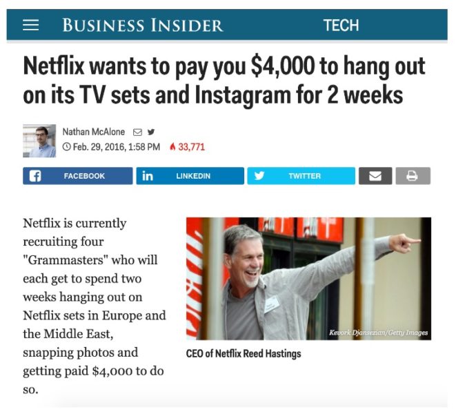
To be fair, this headline got a few things right. But just two.
ICYMI: Here’s what non-fake news looks like
Address your audience as “You”
As a smart former colleague of mine says, Facebook is a place where people go to talk about things. Could be wedding photos. Could be what they had for brunch. Could be Donald Trump’s border policies.
No matter what that thing is, though, each individual is the protagonist of his or her feed. People are inherently egocentric, and social media enables them. With that in mind, pronoun choice plays an important role in remaining conversational.
In headlines, “I” sets up an opinion or anecdote. That device works well in stunt journalism. “We” is either a collective that includes the reader or some haughty construction—frequently a handed-down-from-the-mountains opinion. “They” creates an existential other. “He” and “she” likely should be spelled out for clarity.
“You,” however, is like talking with a friend. It’s how someone tells you a story at a party. It’s how most of this article is constructed. It lets the writer talk to the reader—and you’ll have more opinions and notions about yourself than anything else in this world. Let’s use “you” whenever possible in headlines. It’s about being sociable, after all.
Use concise, relevant reference points
Netflix and Instagram are ubiquitous; just about everyone with a smartphone or computer uses them, and if Ted Kaczynski were still living in his shack, even he’d probably be able to tell you what they do.
On the other hand, if you write a great story about an event, brand, or person not immediately recognizable, you need to explain what it is and why it matters within four words. More than that, and you’re meandering. Headlines work the same way metaphors do: Identify the unknown by what’s already known.
Netflix and Instagram, in this example, let the audience latch on to familiar concepts. Without those hooks, your audience just keeps scrolling. But that’s the extent of what BI did right: the conversational “you” and these reference points.
Here’s how Thrillist packaged the same story, and propelled it to be the No. 1 story on Facebook in that same 24-hour period.
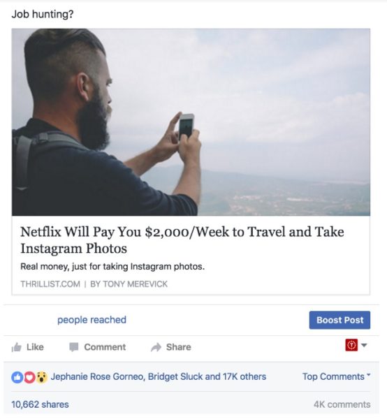
Look at those Facebook interactions: 17,000 reactions, nearly 11,000 shares, and 4,000 comments.
Let’s examine what’s different in this presentation and why it worked so much better.
A job that will pay you to travel and take IG photos
Most people already love to travel, or at least the idea that they would if money were no object. The proliferation of travel feeds and bloggers leveraging Instagram into money proves there’s money to be made in wanderlust. Most importantly, the idea that you can turn an avocation into a vocation simply sounds like a dream come true.
This post differs from the BI article in that “traveling” offers far broader appeal than “hanging out on TV sets,” unless that TV set is for Magnum, P.I., because that’s just a great show. Jokes aside, “Traveling” simply raises the potential ceiling on the number of people interested.
You’ll make $2,000 per week
The median household income in the US was $53,657 as of 2014. $53,000 is pretty close to $52,000. Back-of-envelope math suggests there are 52 weeks in the year, and if you made $52,000, that’d be $1,000 per week—pretty close to the median.
This job, then, pays twice the average American’s salary. To be clear, it’s only a two-week gig. Most people won’t quit their jobs for $4,000 and a vacation. But by framing it as $2,000/week, rather than the $4,000, there’s a natural curiosity gap.
“I want to know how!” the Facebook user says, then clicks to find out. The framing may seem disingenuous, but it’s really six of one, half a dozen of the other. It’s all about context, and it plays in a gray area that’s not a cop-out—you still get what you came for when you click through.
You’ll make $2,000 per week to travel and take Instagram photos
Just want to reiterate here. It’s more than most people make, to do something they already love to do.
“Netflix” legitimizes this job
Sure, jobs exist where people take Instagram photos for a brand. And that might involve travel. Those people are called social-media managers, but that’s a different, low-paying line of work, and likely requires training you don’t have.
Netflix, in this case, serves as a reference anchor. And it accomplishes that in one word. This causes the following stream of thoughts in the reader:
Hey, I like Netflix. I like traveling! I like taking Instagram photos!! I want to make $2,000 per week!!! HOLY SHIT!!!! HOW DO I DO THIS?
Now compare this headline to those of others sites that show up in Google News.
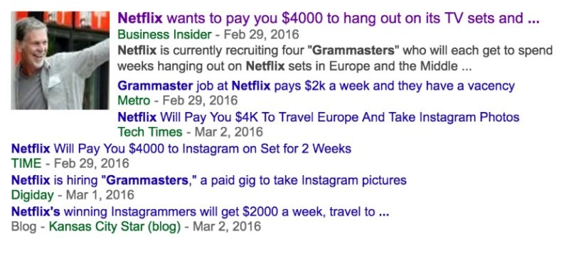
Bad headlines
Hey, it’s BI’s story. Then a litany of headlines that each get part of it right, but none getting all of it right. Nobody knows what a “Grammaster” is, and its only utility lies in SEO—not front-facing headlines. Let’s look at a few more.
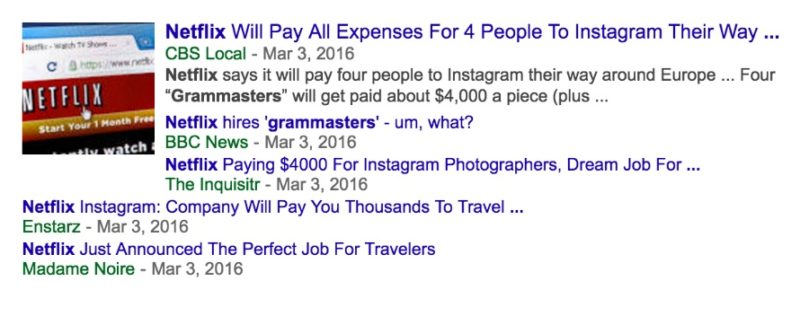
More bad headlines
BBC News and Madame Noire whiffed hard on their presentations. Don’t get too cute. Most people are scrolling too fast to absorb your in-the-forest media cleverness, and they’ll never stop to read your headline that lacks concrete details.
TL;DR: know what your audience cares about and deliver that in as few words as possible.
Ensure the main image gels with the headline
Netflix CEO Reed Hastings doesn’t make for an engaging main image. Imagine scrolling through your Facebook feed and seeing a photo of a 55-year-old white guy with a goatee.
I don’t know who that guy is. He looks like he might be important. Meh.
*Continues scrolling*
The main image on Thrillist’s piece accomplishes several feats:
- Its scenery invokes the wanderlust set by “travel and take IG photos.”
- It features a human doing the “travel and take IG photos” actions.
- It features a human who could be me and isn’t terribly stock-image-y.
Now, no, your entire audience isn’t hipsters with curtained hair and a beard. That’s why Vice exists. But according to a Georgia Institute of Technology and Yahoo Labs study, Instagram pictures with “human faces are 38 percent more likely to receive likes than photos with no faces. They’re also 32 percent more likely to attract comments,” regardless of whether they look like they ride fixies and eat locally sourced foods. Faces help. A lot.
How to choose a great main image is another post altogether. The point, though, is this image parallels everything accomplished in the headline. In tandem, they propelled Thrillist’s post past even the original source. That’s an achievement.
There’s no hard science to it, but the more you consider the relationship of readers to the few words you have to capture anyone’s attention, the better chance you have of rising to the top of any algorithm.
ICYMI: Facebook got rid of bots following news organizations. One outlet saw its followers “decimated.”
Has America ever needed a media defender more than now? Help us by joining CJR today.


