Sign up for The Media Today, CJR’s daily newsletter.
A recent Zoom event for readers of New York magazine posed the question: What makes a great magazine cover? “The idea is really to talk about how our idea of a cover has intersected with this crazy time in which we’ve been living,” Chris Bonanos, the city editor, said. He might have been referring to a few kinds of craziness, one being the collapsed newsstand market; according to public circulation figures, more than 95 percent of New York’s sales come from print and digital subscriptions, not one-off purchases. As editors showed off prime cover examples (an illustration of Donald Trump pinned beneath a giant peach, from his first impeachment; “Don’t Panic” with the first word crossed out, from the start of the pandemic), a member of the audience—a digital subscriber, presumably—typed into the Zoom chat: “I love these covers. Where can I see them online?”
In the internet age, does a magazine cover still matter? “I think the realistic answer is no, it’s not as important as it once was,” Arsh Raziuddin, who has designed covers for The Atlantic and recently started as the creative director for Bon Appétit, said. Josef Reyes—the design director for Bloomberg Markets, who has worked for Wired and New York—agreed: “The main goal with designing a magazine cover is that it sticks out of the newsstand, right? I think that’s kind of outdated now.”
Beginning in the 1920s, magazine executives relied on attention-seeking covers to drive newsstand sales, which proved to be more lucrative than subscriptions. At People, Richard B. Stolley, the founding editor, is reported to have developed a ranking methodology for cover stars: Young is better than old, pretty is better than ugly, rich is better than poor, film is better than TV, and anything is better than politics. Cover lines deployed techniques that readers today would recognize as clickbait. In 1973, National Lampoon mocked desperate magazine covers with one of their own, featuring a dog beside a man with a gun and declaring: “If you don’t buy this magazine, we’ll kill this dog.”
A lot has changed since then. “I think covers are an example of what’s happening generally in the magazine industry, which is that we’re always constantly asked to do more with less,” said Lindsay Ballant, who was until recently the art director of The New Republic. “If I hear of a cover, it’s usually because it’s bad,” she added. “I just don’t think of covers that really are as powerful as they were in terms of steering conversation.”
Yet for many legacy magazines, Raziuddin said, “the cover is the baby.” D.W. Pine, the creative director at Time, has been there for twenty-three years; the team that works on the cover is the same size as it was when he began—about a dozen people—and the budget is identical. “The actual process has not really changed that much,” he said. “It’s still an eight-by-ten-and-a-half-inch blank canvas that I’m staring at that we have to figure out how to fill.”
The main difference today, he continued, is that most readers see Time’s cover digitally. “I approach the cover now as more like a journalistic poster,” Pine said. Lots of text, which might once have beckoned from an airport newsstand, doesn’t translate on social media. “People are seeing these, most of the time, in a smaller format.”
Many of the old rules apply online, though. “Let’s say you’re standing, like, twenty feet away from a newsstand,” Reyes said. “Ideally, you can see the cover stick out, right? For it to stick out, you need to have really strong shapes in there. Bold colors. And that’s actually the same dynamic on a timeline.”
“We’ve been doing more illustration than I have ever expected,” Emily Kimbro, the design director for Texas Monthly, said. An artist’s work stands out in a world awash with phone photography. For the magazine’s barbecue issue—one of its most popular—Kimbro ran a still-life portrait of a plate of brisket in the style of a Dutch master.
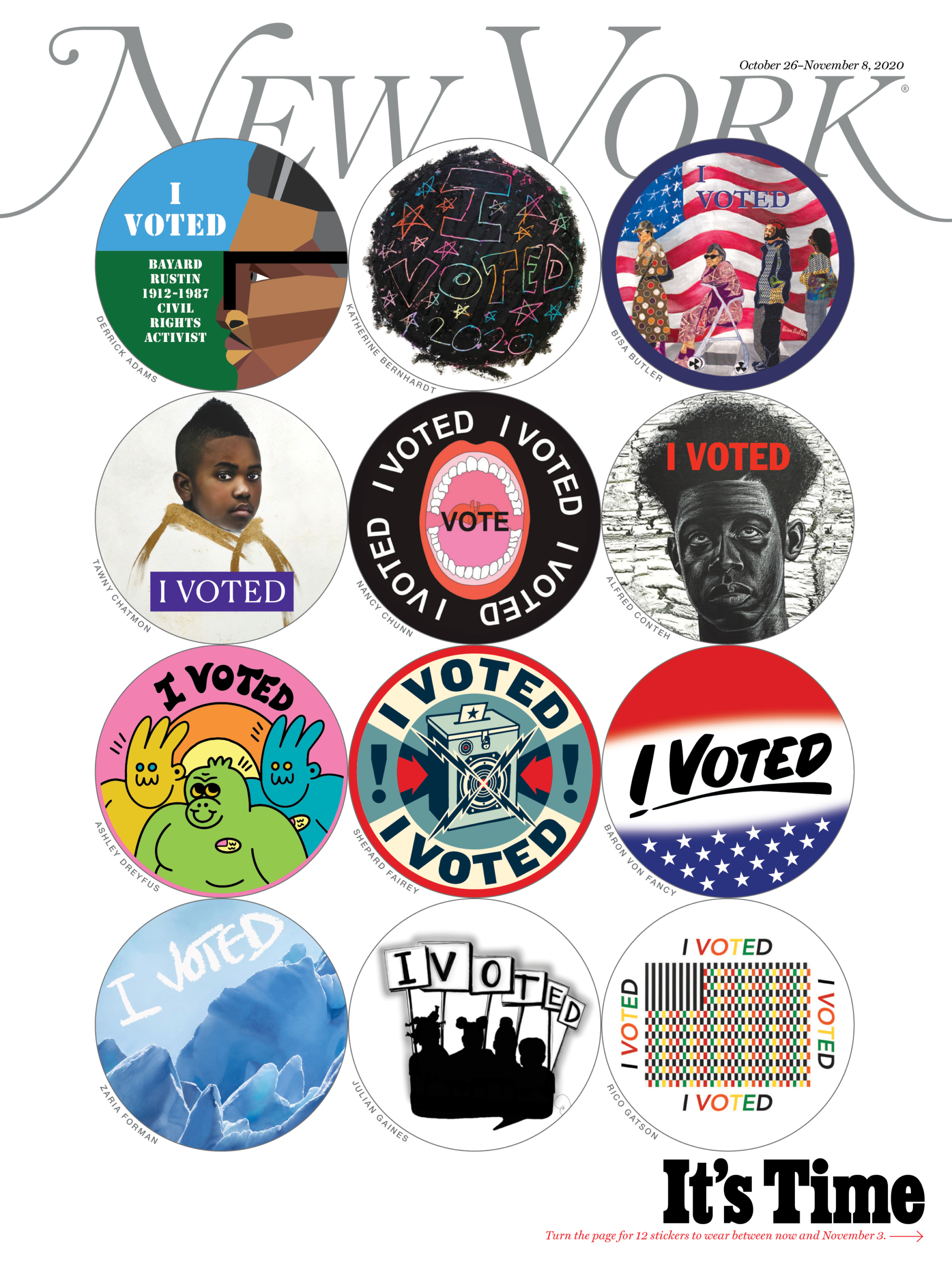
At New York, Jody Quon, the director of photography, has maintained her faith in covers—and, for the past decade, managed to retain a budget and staff of the same size. “What the cover does, it gets people talking,” she said. At times, that requires playing to the magazine’s strengths as a physical object—think election issue covers with “I voted” stickers.
Pine has taken Time in another direction: NFT covers, sold as digital collector’s items. “Once a month, we do a new drop,” he said. Plus: “I just had a piece in Sotheby’s.” It was a collage of more than five thousand Time cover lines (“Is God Dead?,” “Are You Mom Enough?,” “Yep, I’m Gay”) surrounding the magazine’s signature red frame. In October, a collector named Amir Soleymani thought it was worth something: he bought the piece through Sotheby’s new “Metaverse” catalogue for nearly ninety thousand dollars.
CJR AT COP26: The end of the road?
Has America ever needed a media defender more than now? Help us by joining CJR today.


